IKON Pass App
Planning a ski trip should be exciting, not frustrating. This project reimagines the Ikon Pass app to simplify the booking process, allowing skiers and snowboarders to spend less time navigating the app and more time enjoying the slopes.
Problem Statement
Problem Statement
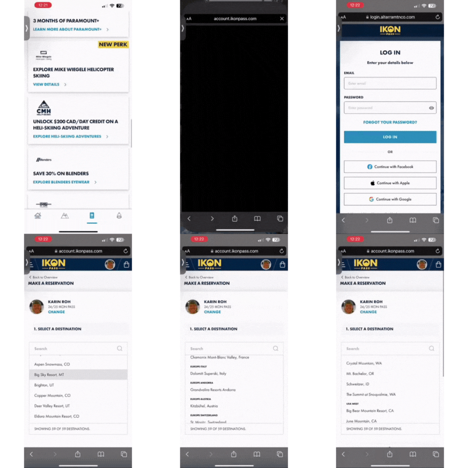
Skiers using the Ikon Pass app need a seamless and intuitive reservation system. The current experience is fragmented, requiring multiple redirects and redundant steps that disrupt trip planning. These inefficiencies make it difficult for users to secure their reservations smoothly and efficiently.
Step 1: Preliminary Research & Usability Testing
The idea for this project stemmed from my own frustrating experience booking a ski day through the Ikon Pass app. Curious if others faced similar issues, I conducted primary and secondary research to validate the problem.

My initial research included:
Analyzing user reviews on Apple’s App Store and Google Play.
Exploring online forums to uncover common pain points.
Speaking with fellow skiers and snowboarders about their experiences.
Conducting usability tests with five participants to evaluate the app’s booking process.
Current Application Usability Testing
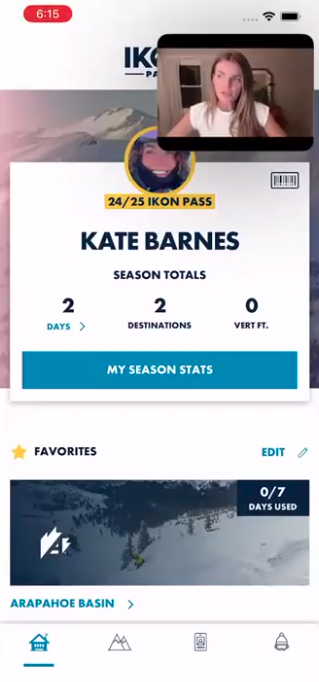
Participants were asked to complete three key tasks: booking a reservation, canceling a reservation, and exploring the app to assess overall usability. The results were telling:
Users struggled with unnecessary steps and confusing navigation.
The average satisfaction score was 1.9/5, confirming the need for a more intuitive solution.
Task Scenarios
Step 2: Low-Fidelity Prototyping & Wireframing
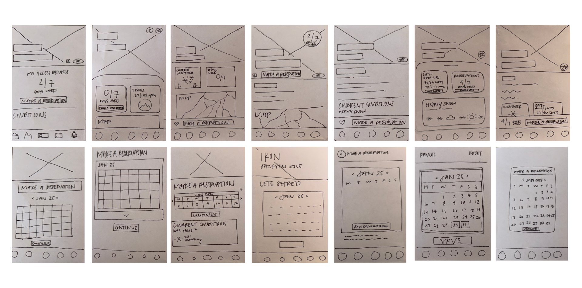
With a clearer understanding of user frustrations, I translated research insights into exploratory sketches using human-centered design methods. From these sketches, I developed a low-fidelity MVP, focusing on streamlining the reservation flow and reducing friction in the user journey.
Step 3: Post-Update Usability Testing
To measure the impact of the redesigned booking experience, I conducted another round of usability testing with the same five participants. The improvements were significant:
The overall satisfaction score increased from 1.9/5 to 4.8/5 (a 153% increase).
Users found the reservation process notably easier and completed their tasks faster.
Step 4: Design Asset Gathering
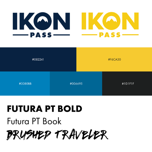
Without access to Ikon’s official style guide, I carefully curated design elements to align with their existing visual identity. This ensured the redesign maintained a cohesive brand feel while enhancing usability.
Step 5:
High-Fidelity Prototype
High-Fidelity Prototype
Using feedback from usability tests, I refined the design into a high-fidelity prototype in Figma. The final iteration focused on:
A streamlined reservation system with fewer steps.
An intuitive dashboard for easy access to bookings.
A hassle-free cancellation process to eliminate unnecessary obstacles and pass revocation risks.
Learnings & Next Steps
This project reinforced the importance of a user-first approach in digital experiences. By identifying pain points and iterating based on real user feedback, the reservation process became significantly more intuitive.
Moving forward, additional opportunities for improvement include integrating personalized trip planning features, optimizing mobile performance, and gathering more extensive user insights to refine the experience further. The next step would be testing these enhancements with a broader audience to ensure the app continues to meet the evolving needs of skiers and snowboarders.


