
Better School Choice
Empowering parents and caregivers to cut through the noise and gain clarity in finding the perfect private school tailored to their children's unique needs and aspirations.
Problem Statement
Problem Statement

Parents and guardians with K-12 aged children need a user-friendly and centralized school search platform in order to streamline the school search process, making it easier for them to make well-informed decisions that align with their values and educational aspirations for their children.
Step 1: Initial
Research Analysis
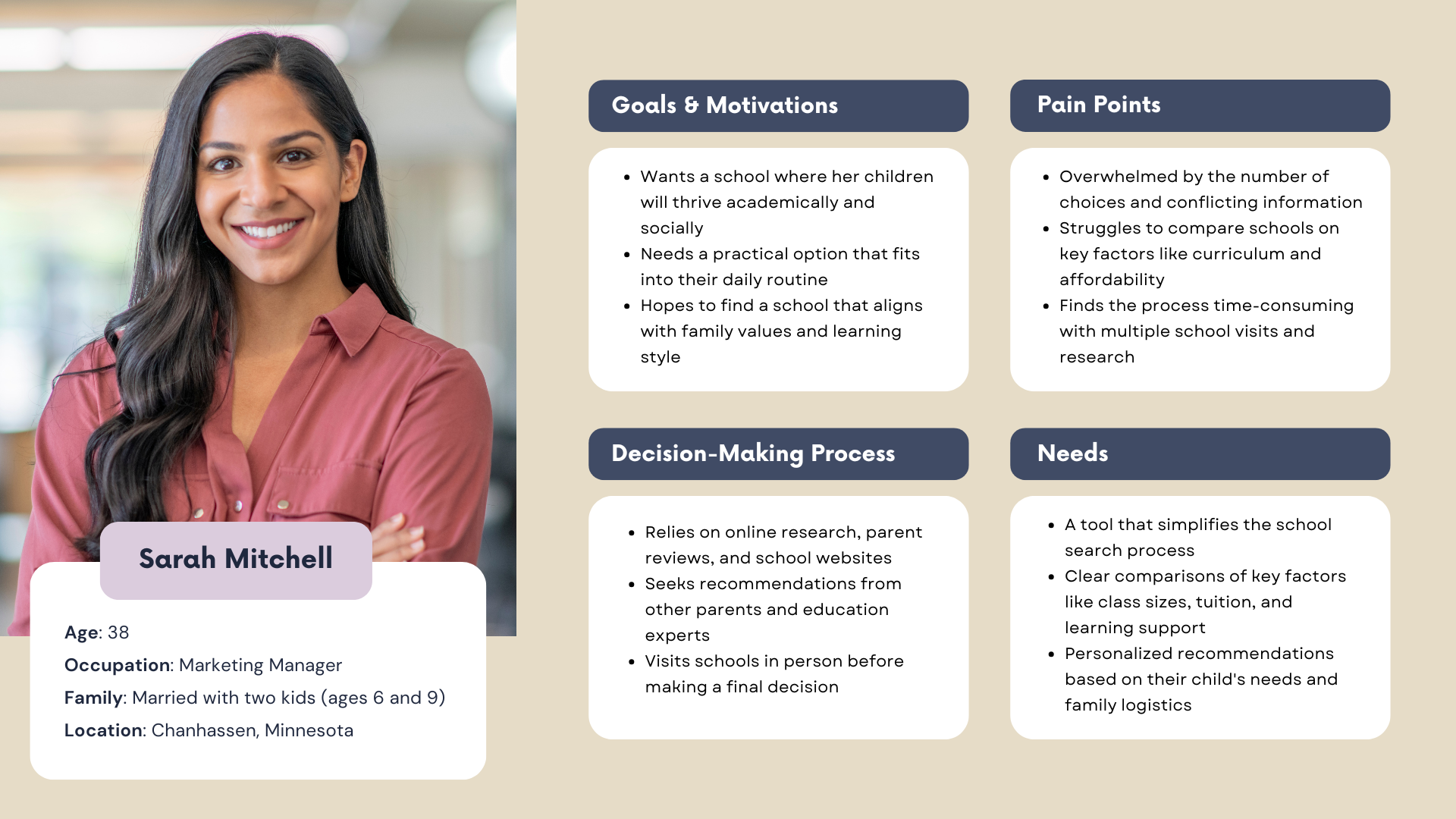
After reviewing six interview transcripts provided by OurKids.org, we found that every parent and guardian wanted the same thing—to find a school where their child could thrive while also fitting their daily logistics. They needed a simple way to find important information about schools so they could make the best decision with confidence.
User Persona


Step 2: Competitive Research
A competitive analysis was conducted on four key rivals of Better School Choice to identify their strengths, weaknesses, opportunities, and threats, providing insights on how Better School Choice can differentiate itself in the market.
Step 3: Feature Prioritization
To build a seamless school search experience, features were prioritized by impact and effort. Core features like advanced search, filters, and school profiles come first, while quick wins like reviews and an interactive map add instant value. Bigger projects, like personalized accounts, will enhance long-term engagement, while lower-priority features may roll out later. This approach ensures Better School Choice stays competitive while delivering the best experience for families.

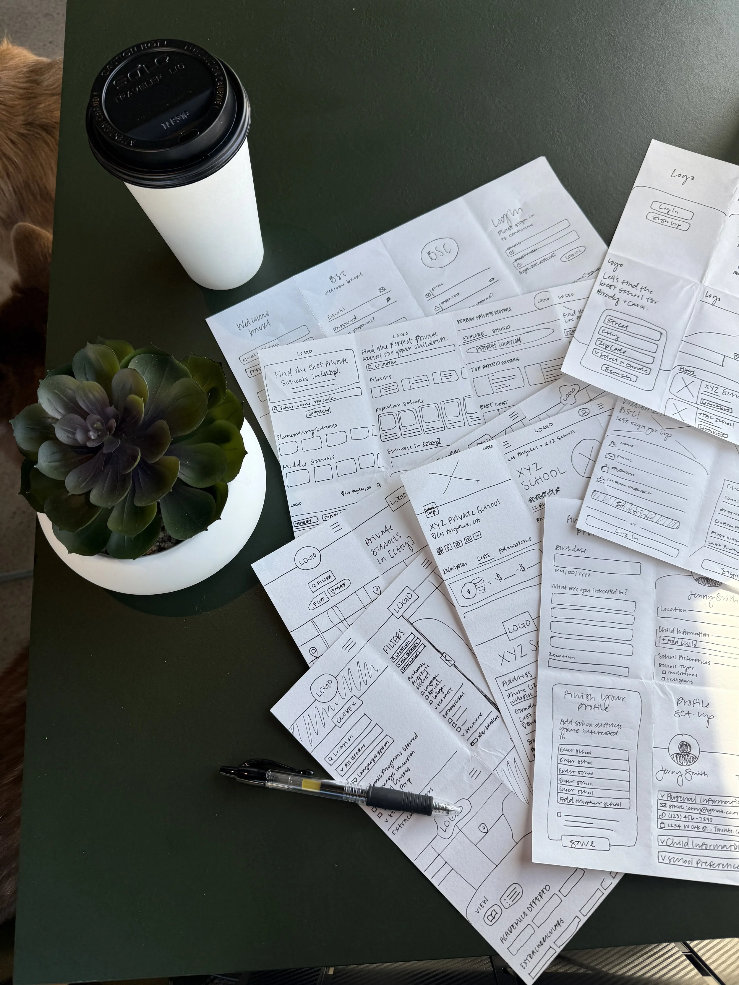
Step 5: Low-Fidelity Prototyping & Wireframing
The initial wireframes and paper prototype were created using Crazy 8s sketches and rapid prototyping techniques, focusing on efficiency and clarity. These early designs prioritized ease of navigation and quick access to key information, aligning with users' needs throughout the school search process.
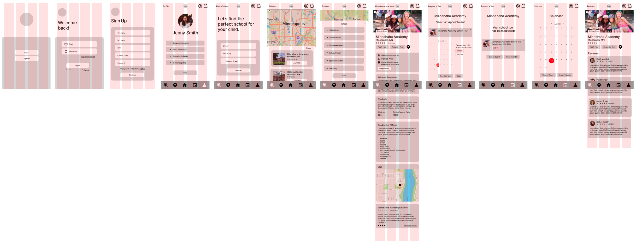
Mobile mid-fidelity prototype with a 4-column responsive layout grid.
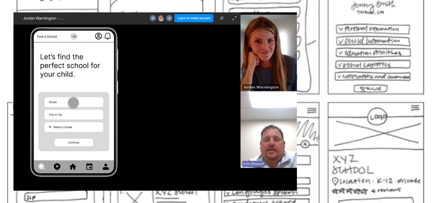
Step 6: Usability Testing
We conducted usability testing on our mid-fidelity prototype with five participants from our target audience via Microsoft Teams and in-person sessions.
Our testing aimed to evaluate three key goals:
Assessing the ease and efficiency of exploring school options using location and filters
Determining the ease of scheduling a school tour
Evaluating the effectiveness of accessing parent/student reviews
Goal 1 - Key Findings
Users had difficulty finding the Filters button, often bypassing it entirely.
Many expected filters to appear automatically after entering location information, leading to initial confusion.
Feedback suggests the Filters button could be more prominent within the search flow.
Goal 2 - Key Findings
Participants easily located the “Request a Tour” button and completed the task smoothly.
Several users recommended linking tour appointments to Google or Outlook calendars to help remember scheduled tours.
Goal 3 - Key Findings
Users located the Reviews section easily and appreciated its placement at the bottom of the page.
Navigation was seamless, with no issues accessing reviews.
Users liked the top-page link to jump directly to the Reviews section.
Overall, participants were satisfied with the design, with minor suggestions to improve accessibility.

Step 7: Style Guide
The style tile for the Better School Choice app was developed through competitive research to establish a cohesive, user-friendly design. This style tile set the visual foundation for the high-fidelity prototype, promoting consistency, accessibility, and enhancing the user experience.
High-Fidelity Prototype
High-Fidelity Prototype

Building on user feedback and the style tile, our final step was to create a high-fidelity prototype in Figma, designed for a polished, user-centered experience. Key updates included repositioning the Filters button for a more intuitive search flow, integrating tour scheduling with Google and Outlook calendars, and adding a quick-access link to Reviews for easier navigation.
Learnings & Next Steps
This project challenged me to turn real parent insights into a seamless, user-friendly design. Leading both research and design, I used empathy mapping and competitive analysis to create a simple, intuitive experience.
Looking ahead, expanding features like interactive school comparison, user accounts, and personalized recommendations will make the platform even more valuable for families navigating their school search.

